MyCareSpace
Helping disability carers to connect with NDIS services
Role
UX/UI Design
Tools
Figma, Miro, Zoom
Duration
6 Weeks (Jan 21')
01 Overview
The Challenge
MyCareSpace is a national online platform that connects people living with a disability, their families and carers, with easy to read information about the NDIS.
The team had a problem. They were unsure if people found the website easy to use and wanted to know answers to the following questions.
-
Do visitors know that we can connect them with NDIS service providers?
-
Are users able to search easily for the service they need, without needing our help?
Highlight
One of their key products is connecting disabled clients with disability service providers through a ‘VIP’ matching service.
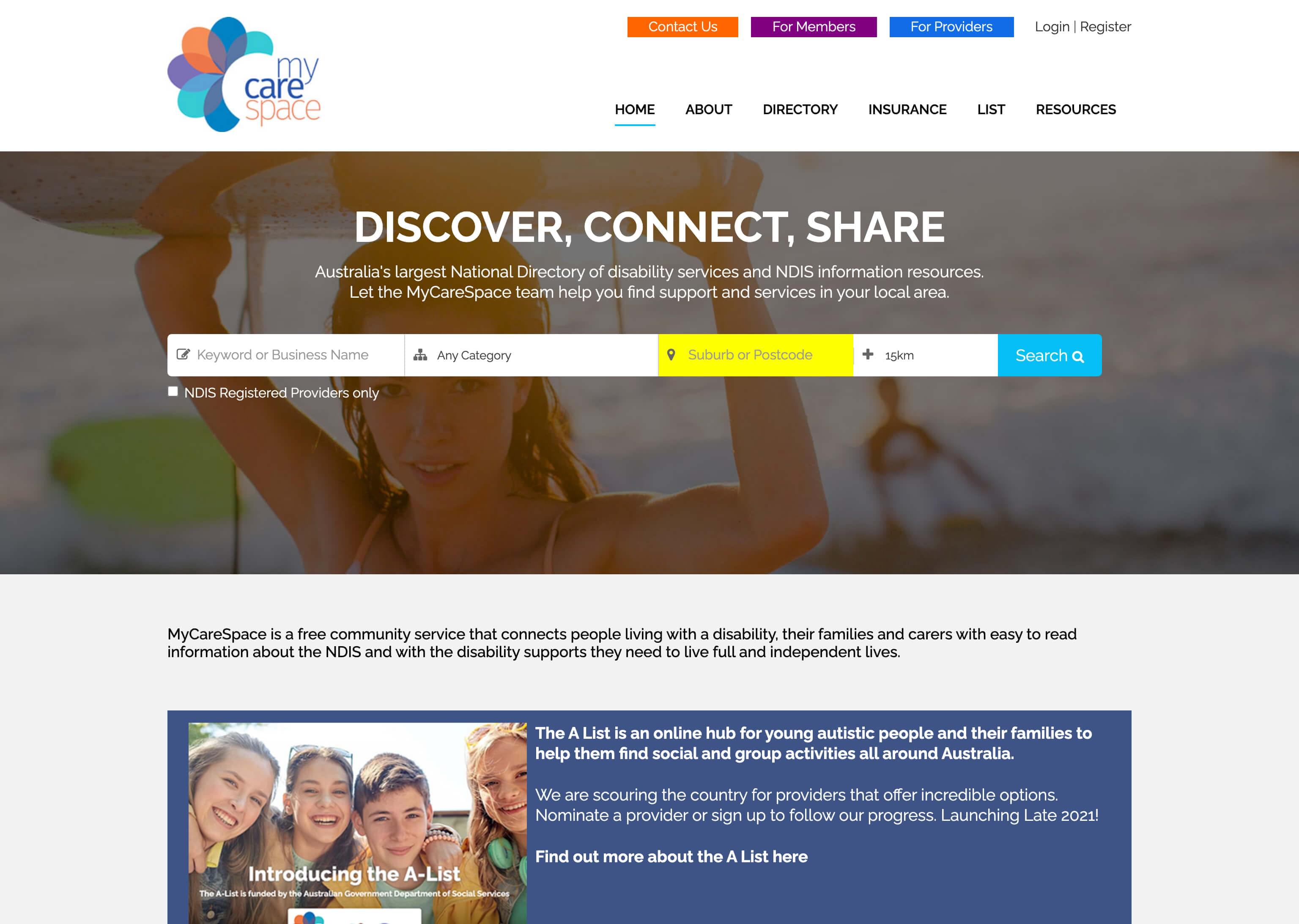
The MyCareSpace homepage.
The Goal
The primary goal was to review the existing UX flow for connecting users with My Care Space through the ‘VIP’ contact form.
We also needed to understand more about the users of MyCareSapce, their feelings and perceptions towards using connection services, and how they used NDIS in their day-to-day lives.
02 Discover
Research
For the discovery phase, we decided to run 1-2-1 user interviews to provide us with direct insights from users.
For our user interviews – we wanted to talk to users that often looked for information about NDIS services for themselves, or on behalf of a client.
Our goals were:
-
To understand how users search for NDIS service providers
-
To understand the common problems, feelings and perceptions when using connection services
-
To run a short task analysis to see how users would go about contacting MyCareSpace
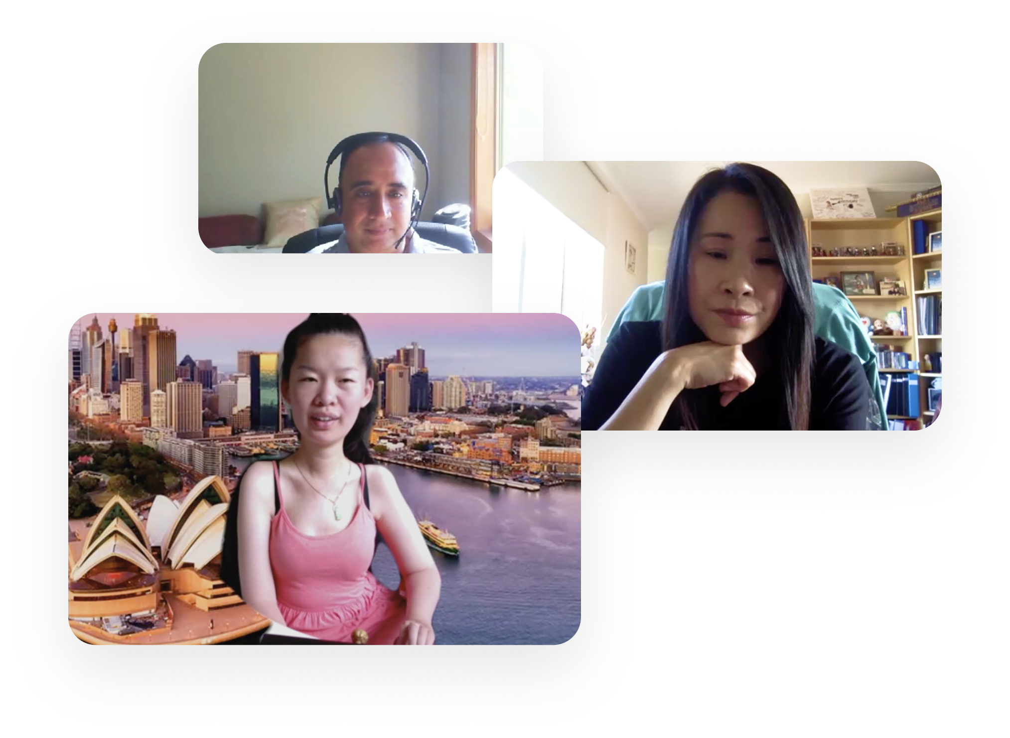
Users interviews with Raj, Mary and Julie
03 Define
Organising Data
After the research phase, it was time to bring together all of our findings and generate insights to help drive the next phase of the project.
We made notes on a shared Miro board and used affinity mapping to help organise the data into groups and themes.
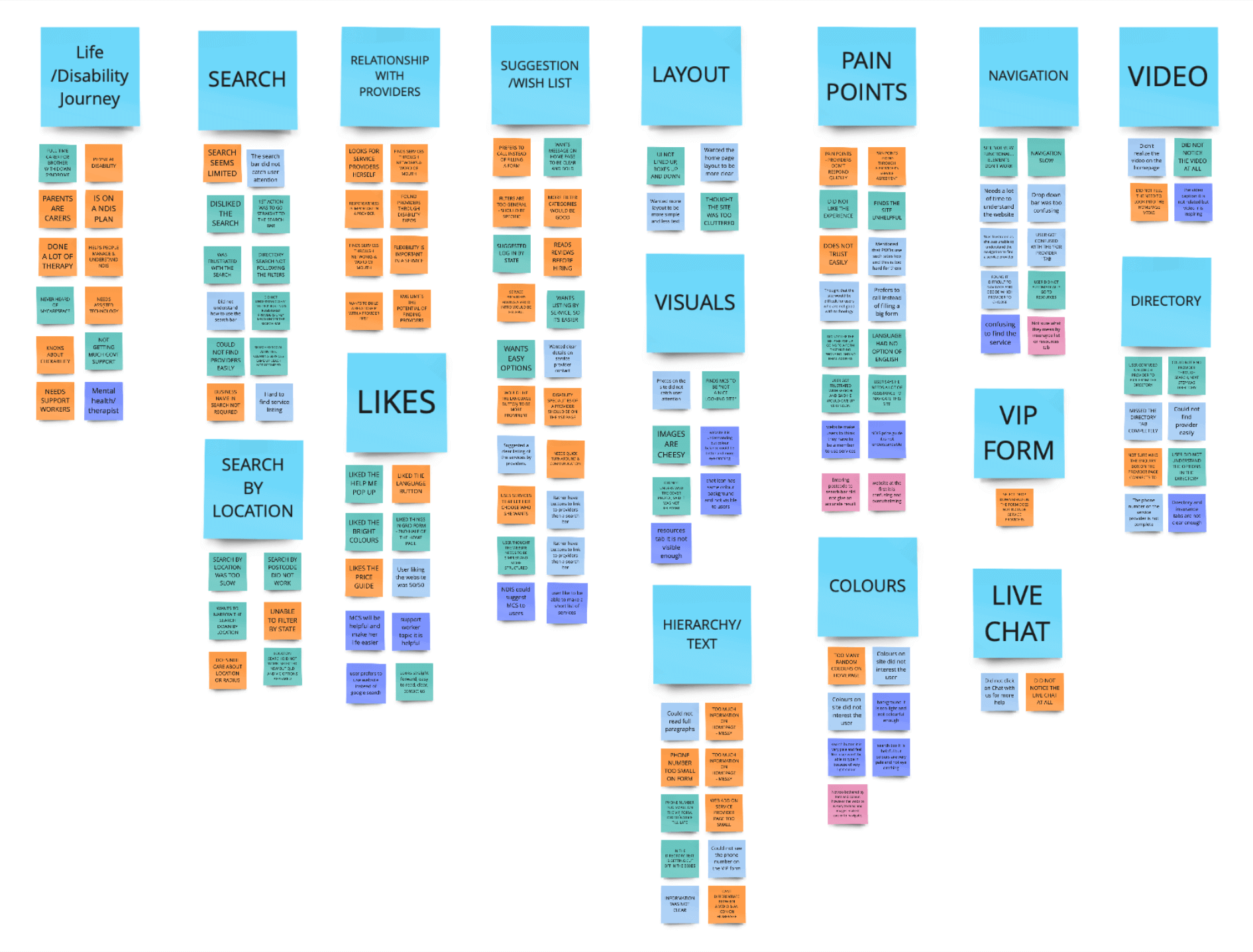
Key Insights
We learnt through talking to users that there were some consistent themes and issues. After discussing the findings together as a group, we generated the following insights.
-
Users didn’t immediately understand the purpose of the website.
The website homepage was confusing, the brand messaging was unclear and the imagery did not tell a story.
MyCareSpace Homepage
-
The VIP form was unclear and too hard to read.
When faced with filling out a form to contact MyCareSpace, users were put off by the number of fields to complete and decided to exit the page instead.
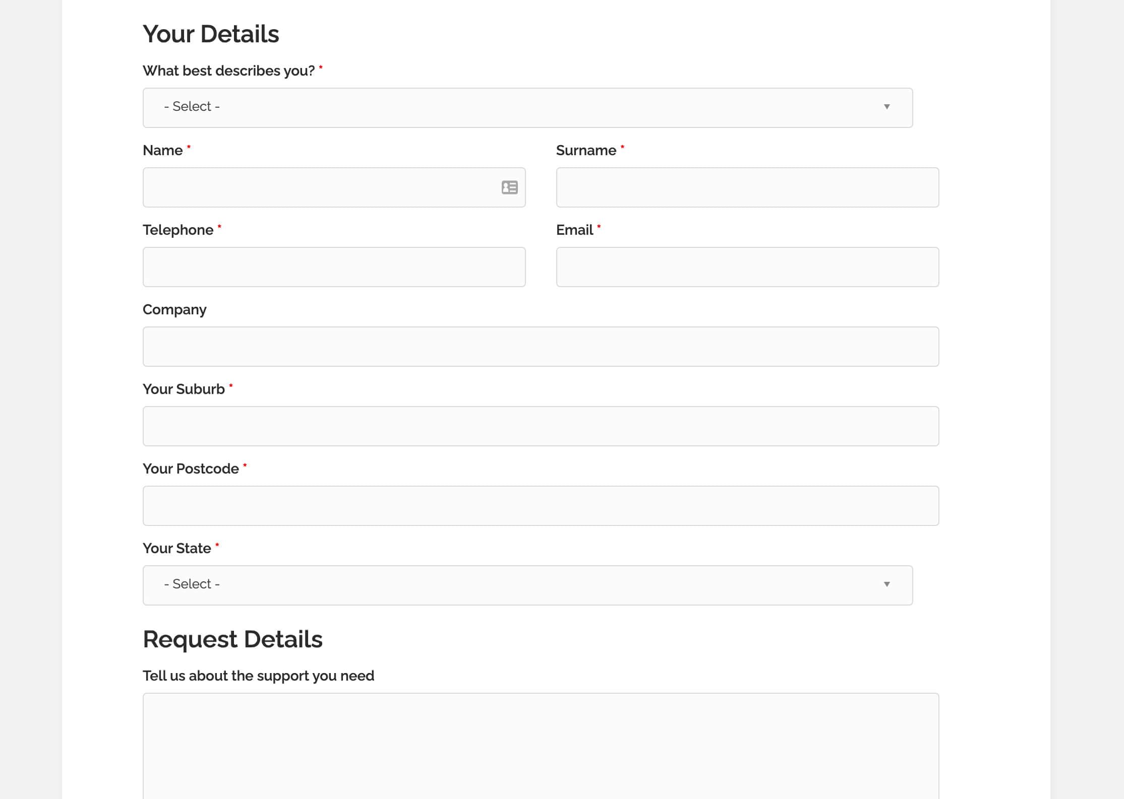
The 'VIP Connection' page contained multiple fields for inputting data.
-
The contact number was too hard to find. When it was shown, it was too small and not easily visible.
Users just want to call sometimes, and the number was too hard to find on the website.
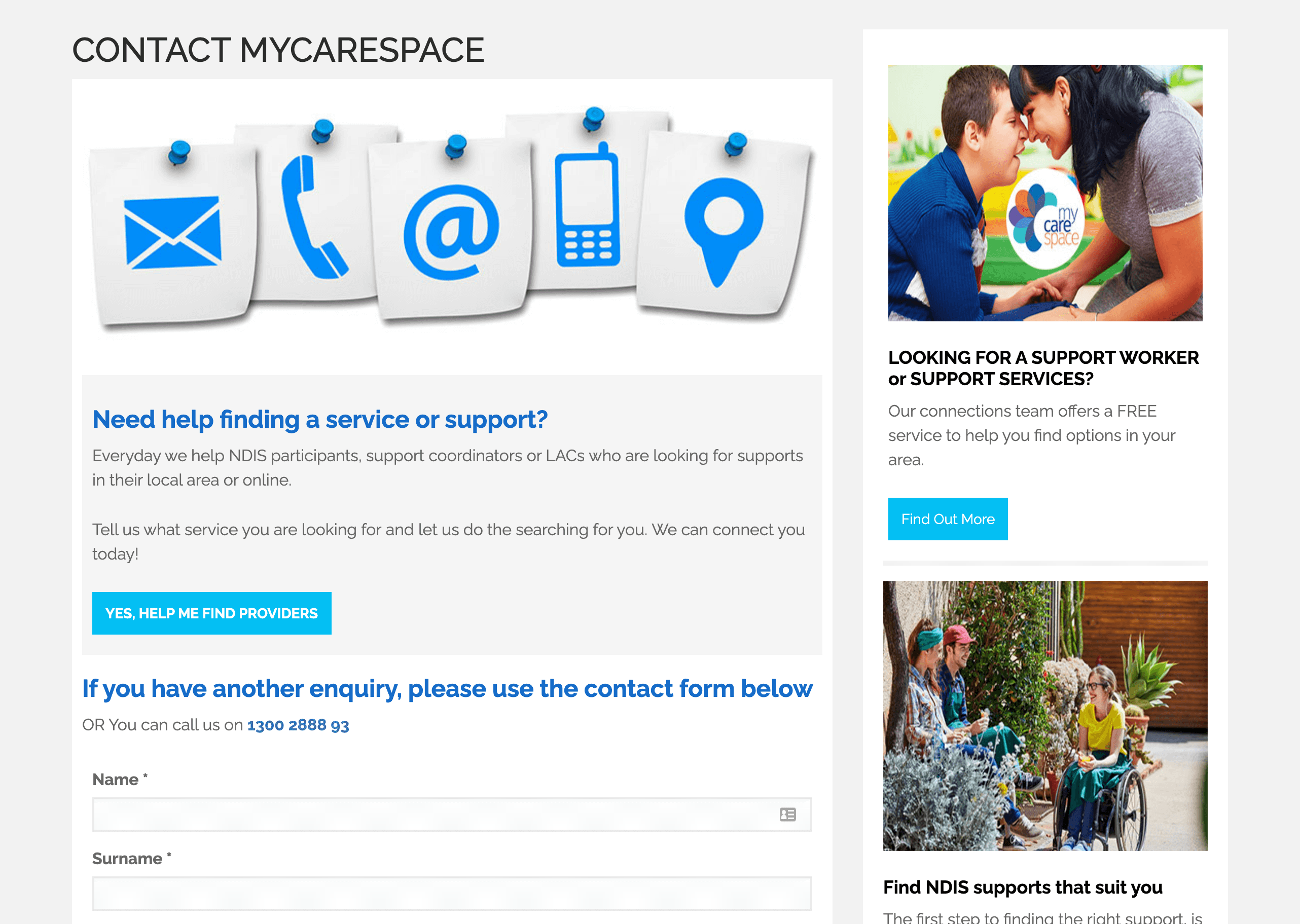
The 'Contact' page
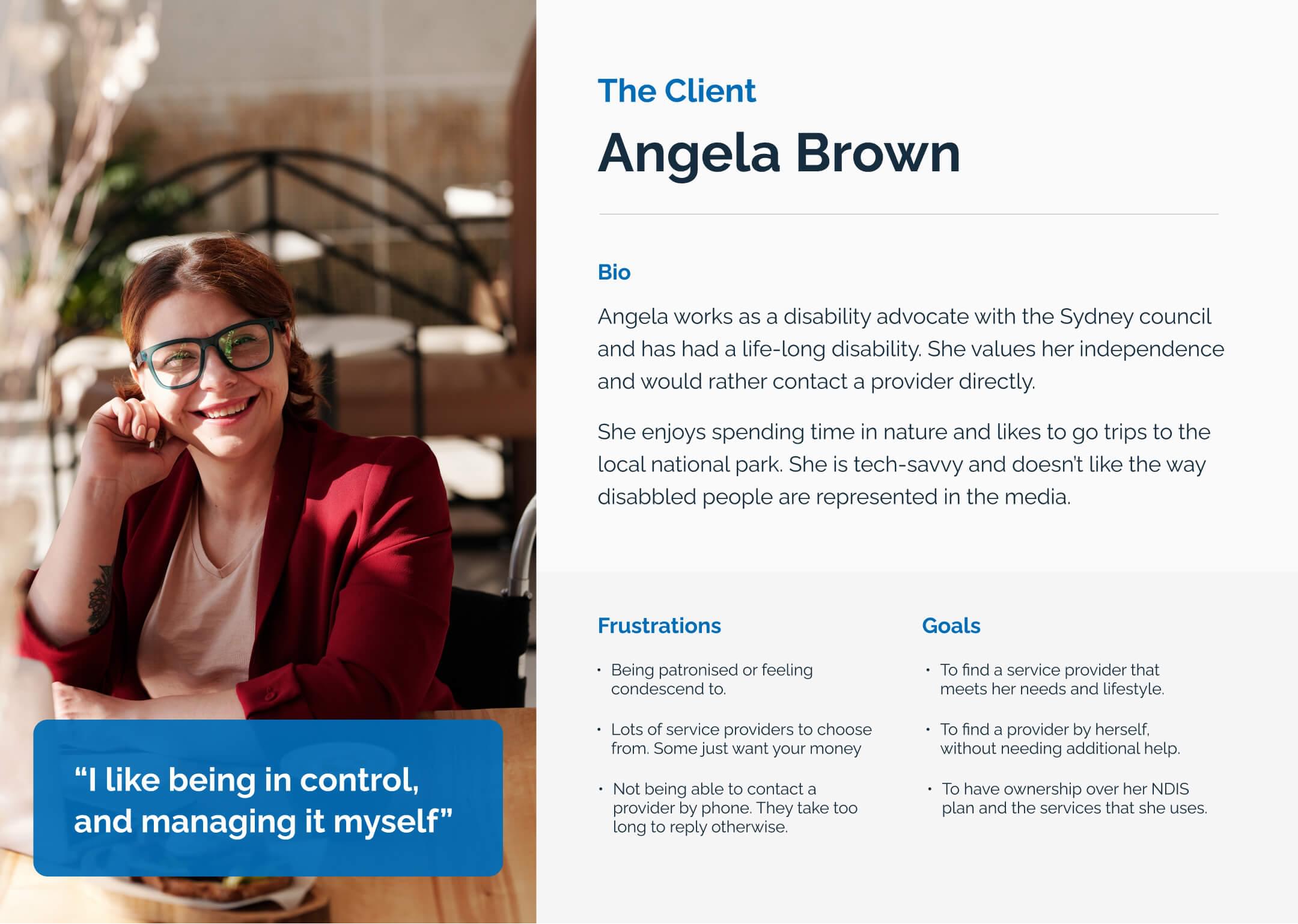
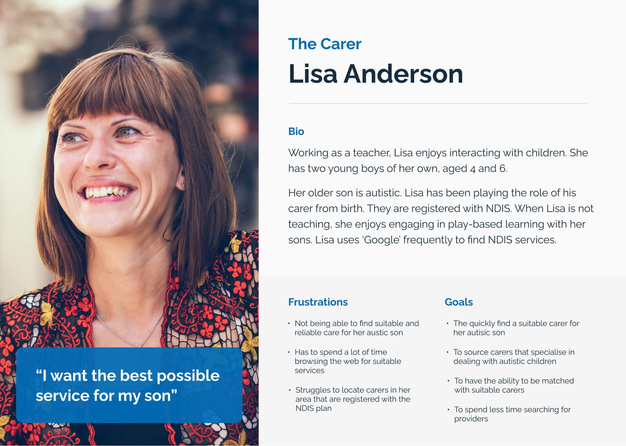
User Personas
Based on our interview we created user personas for the two main visitors to MyCareSpace – carers and clients. This would help us design with the end-users in mind.
The Carer
The Client
Reframing the Problem
After reviewing our insights, we re-framed the original brief into a problem statement.
After discussions with MyCareSpace, we decided to use the persona of the ‘The Carer’ as the primary user we would be designing for.
Problem Statement
At the start of their search for NDIS providers, disability carers visit the MyCareSpace website looking for information and feel confused.
They do not realise that MyCareSpace can help them connect with NDIS service providers.
They want to connect with MyCareSpace to answer questions they might have about NDIS, but are unsure of how to do so.
After generating the problem statement, we created several ‘How Might We’ statements. We chose three of them to form the basis for ideation, and to help guide the rest of our design process in the ‘Develop’ phase.
How might we…
Simplify the process of contacting MyCareSpace, so that users don’t feel put off by filling out an endless form?
How might we…
Make it easier for carers to contact MCS about services or providers, so they can get a quicker response to their questions?
How might we…
Better communicate the services that MyCareSpace offers so that users understand know what to do next?
04 Develop
Ideation
For the ideation phase, we focused on the key problems and pain points felt by our users — that they did not understand what services MyCareSpace offered, that it was difficult to contact them quickly.
To address issues with contacting MyCareSpace, we decided to focus on improving the VIP service matching form.
When brainstorming ideas we came up with the following features and requirements:
-
To be able to collect basic contact information from users
-
To collect personalised information about their current journey in NDIS
-
To guide users through the form process and reduce overall cognitive load
-
To provide easy access to contact MyCareSpace directly
-
To provide resolution at the end of the form, and reassure users that MyCareSpace would reply quickly.
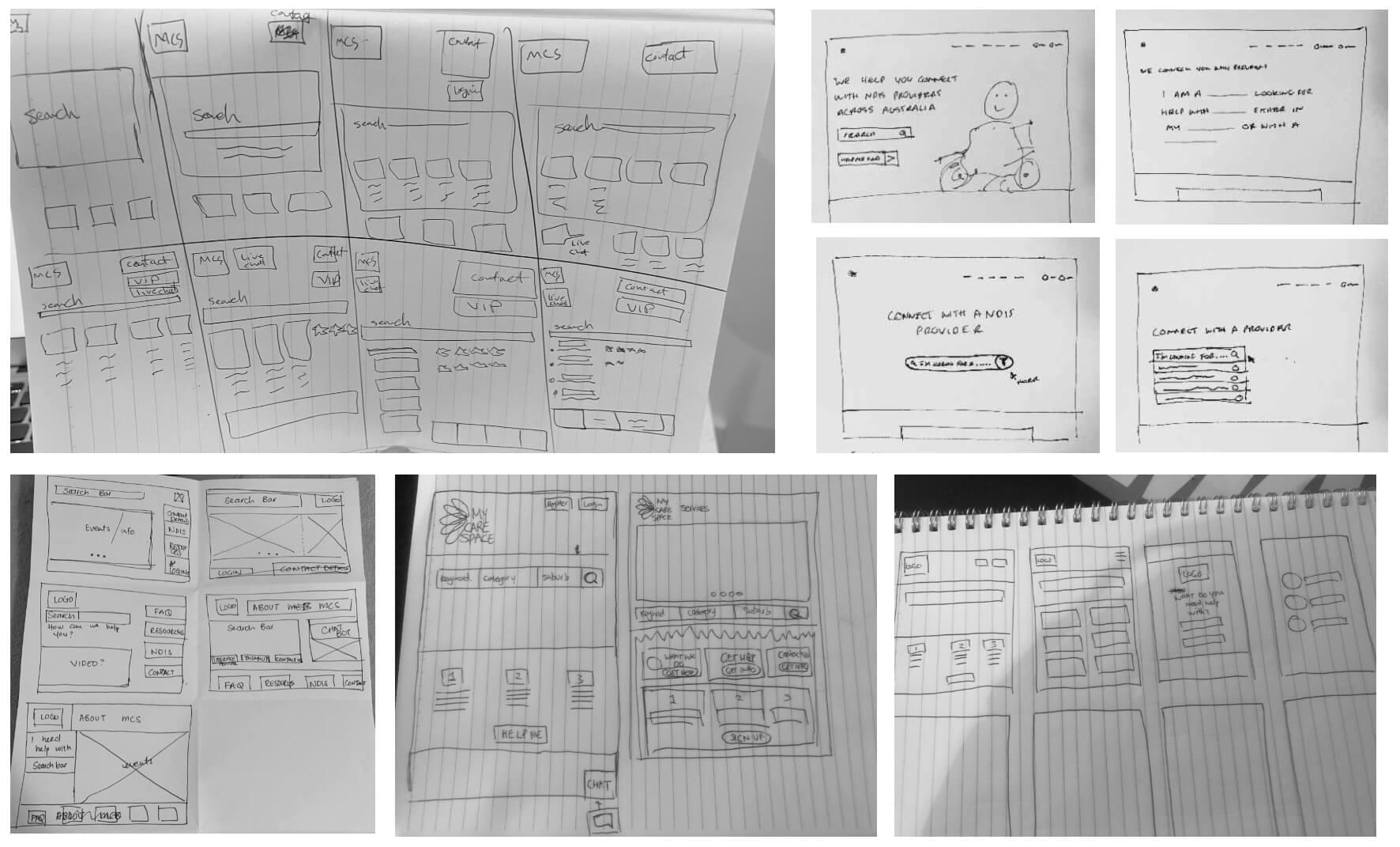
Our team brainstormed ideas and shared using the Crazy 8's technique
User Journey
For the user journey, we started with a basic user flow that would highlight the validations needed at different points of the journey.
We wanted to give the users the control to go back when needed, and also to review the form at the end before the pressed submit.
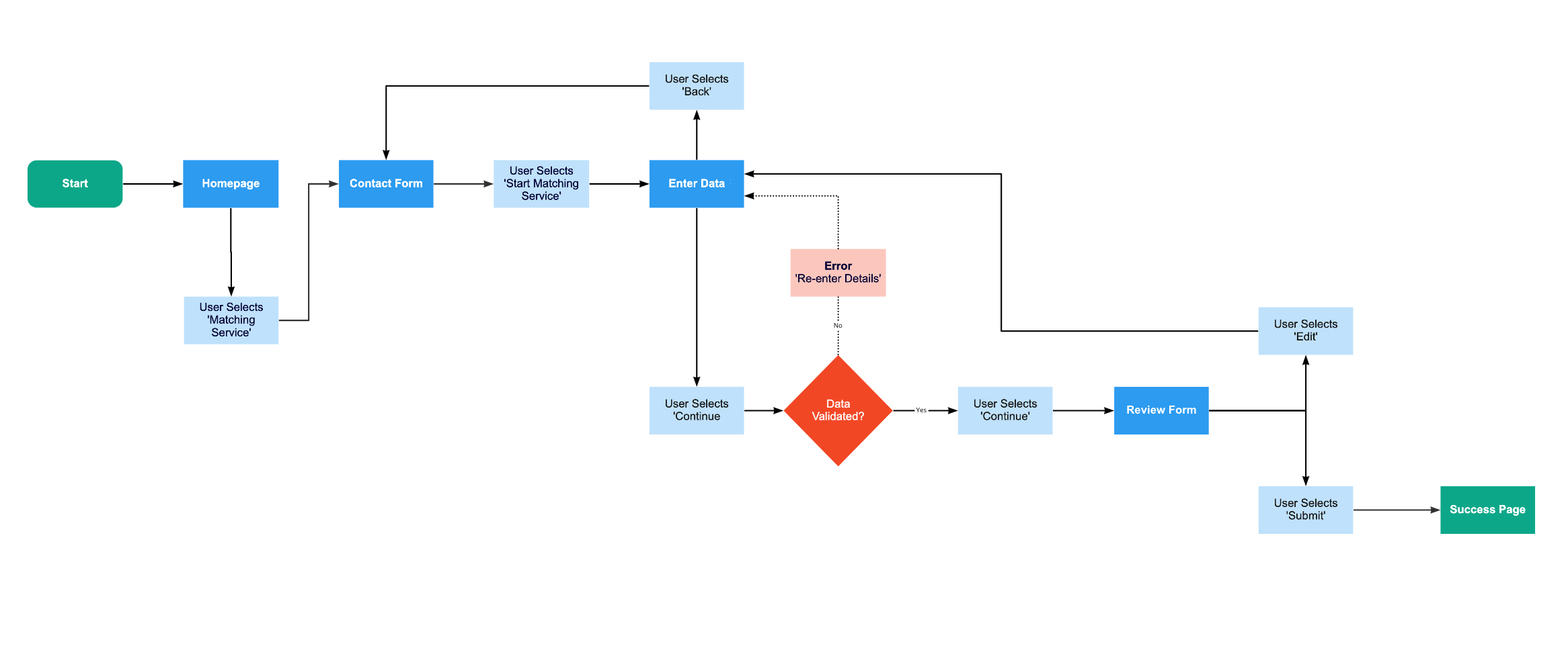
We created the user journey collaboratively using Miro
05 Deliver
The New Homepage
-
A Refreshed Look
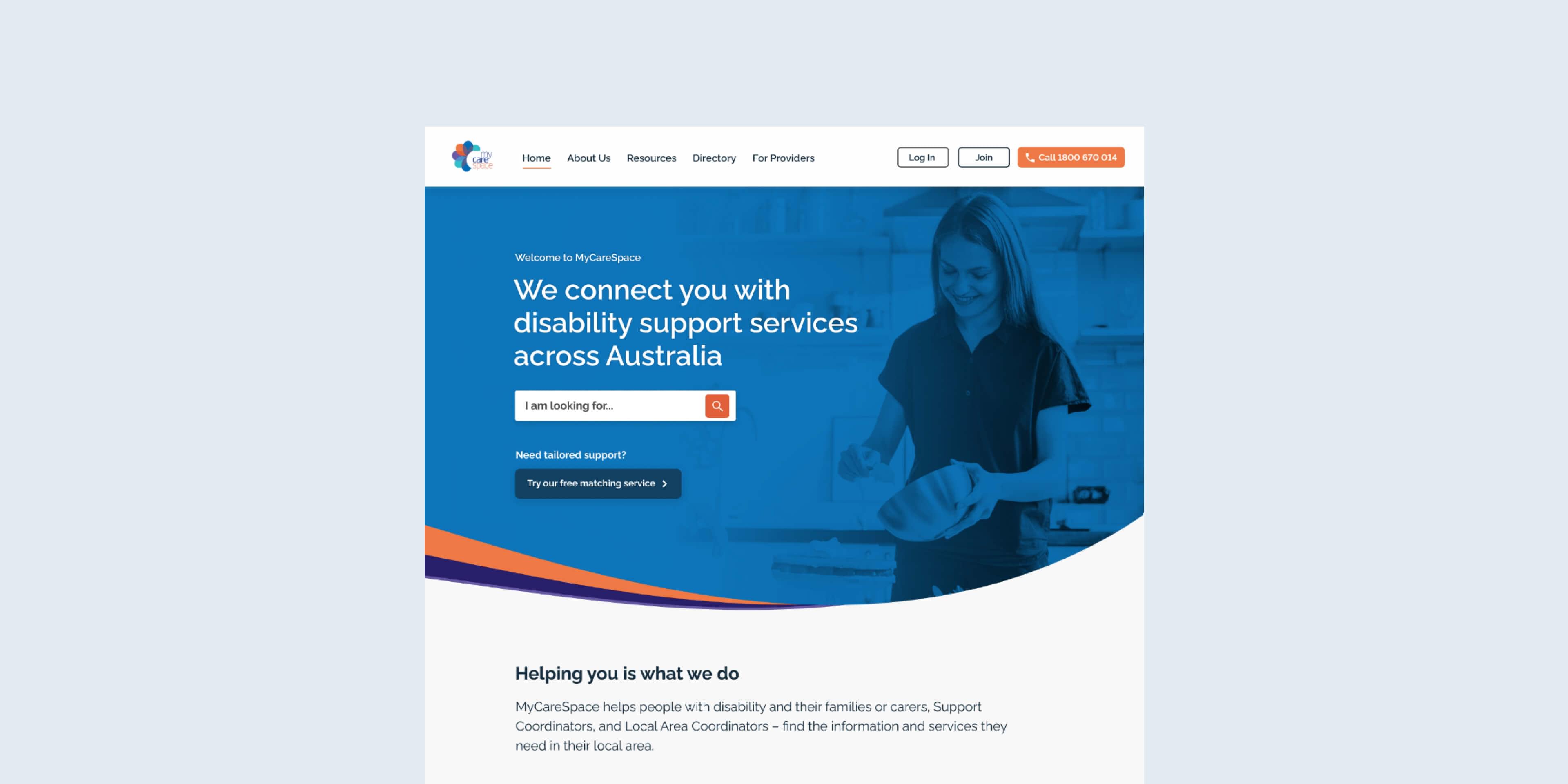
The new hompeage is streamlined to reduce clutter. We also added hero image matched with an inspiring quote.
Overall, we felt it was important to simplify and reduce the amount of clutter on the homepage.
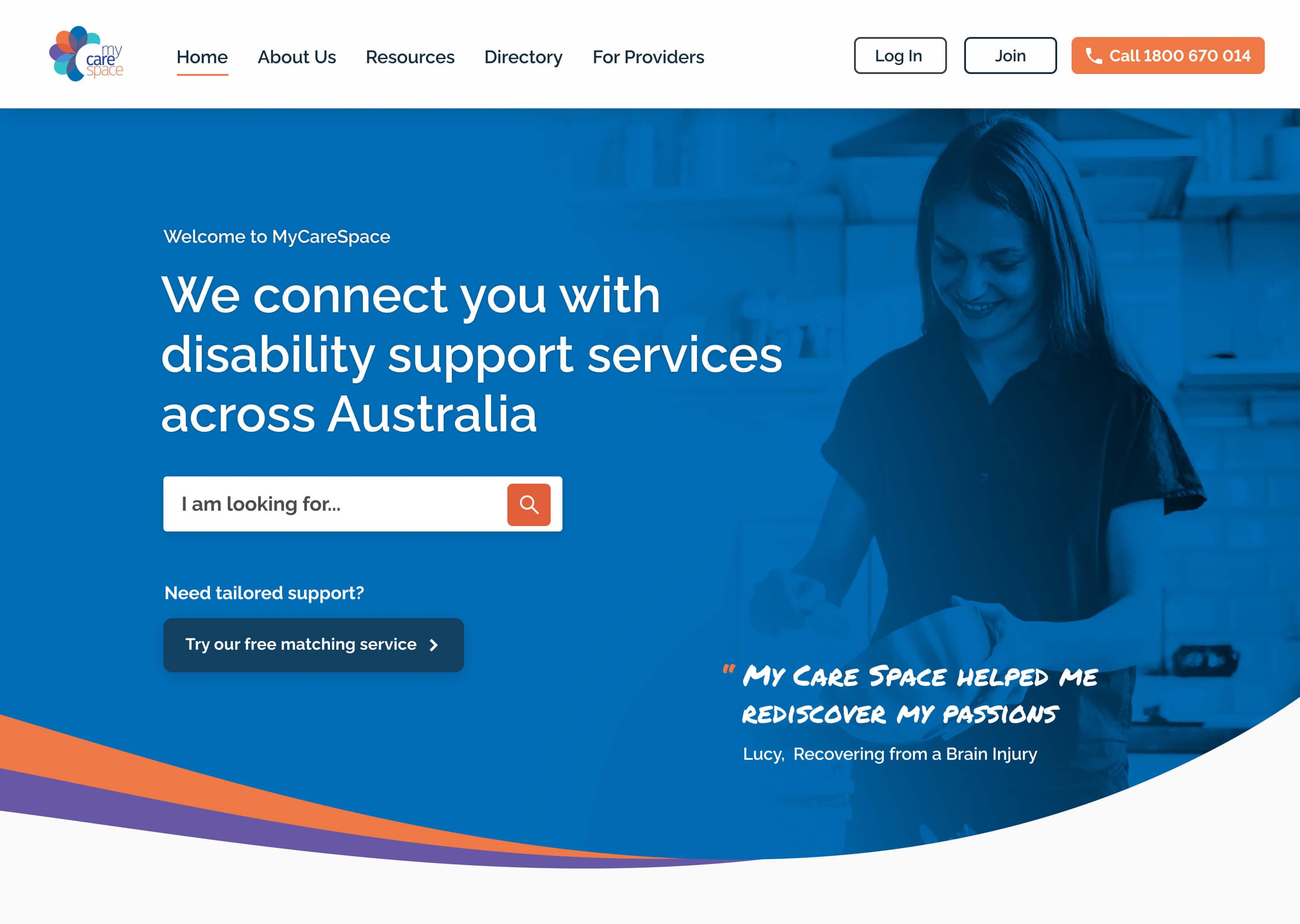
The new homepage kept the typeface and colour scheme from the existing brand.
-
Updated messaging
Our users were confused about the purpose of the site – so we updated the hero message to make it clear that MyCareSpace connects you with disability support services.
We also removed a lot of the clutter around the search bar, and added a direct CTA to the free matching service.
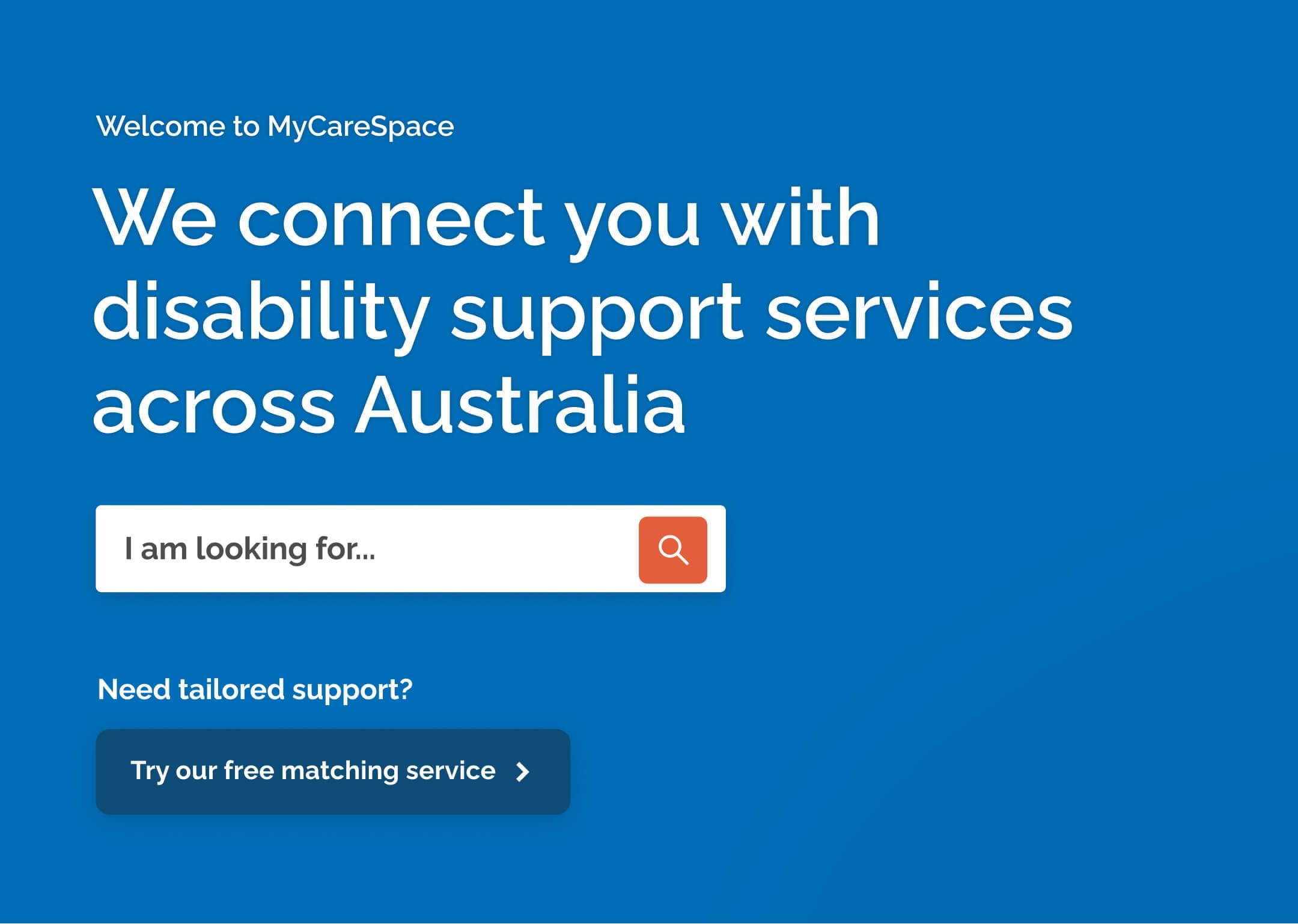
Two clear CTAs reduce the amount of time a user has to make a decision.
-
Call When You Need To
Our users wanted to contact MyCareSpace directly by phone, but they found it hard to find a direct number they could call.
So we added a contact number to the site header, to give users a direct way of contacting MyCareSpace from all pages on the website.
The New Matching Service
-
Introducing the Service
To help on-board users, we started with re-designing the intro page to show what the service does, and the benefits it would provide.
We also provided social proof using large marketing images, with quotes that re-affirmed the success of the service.
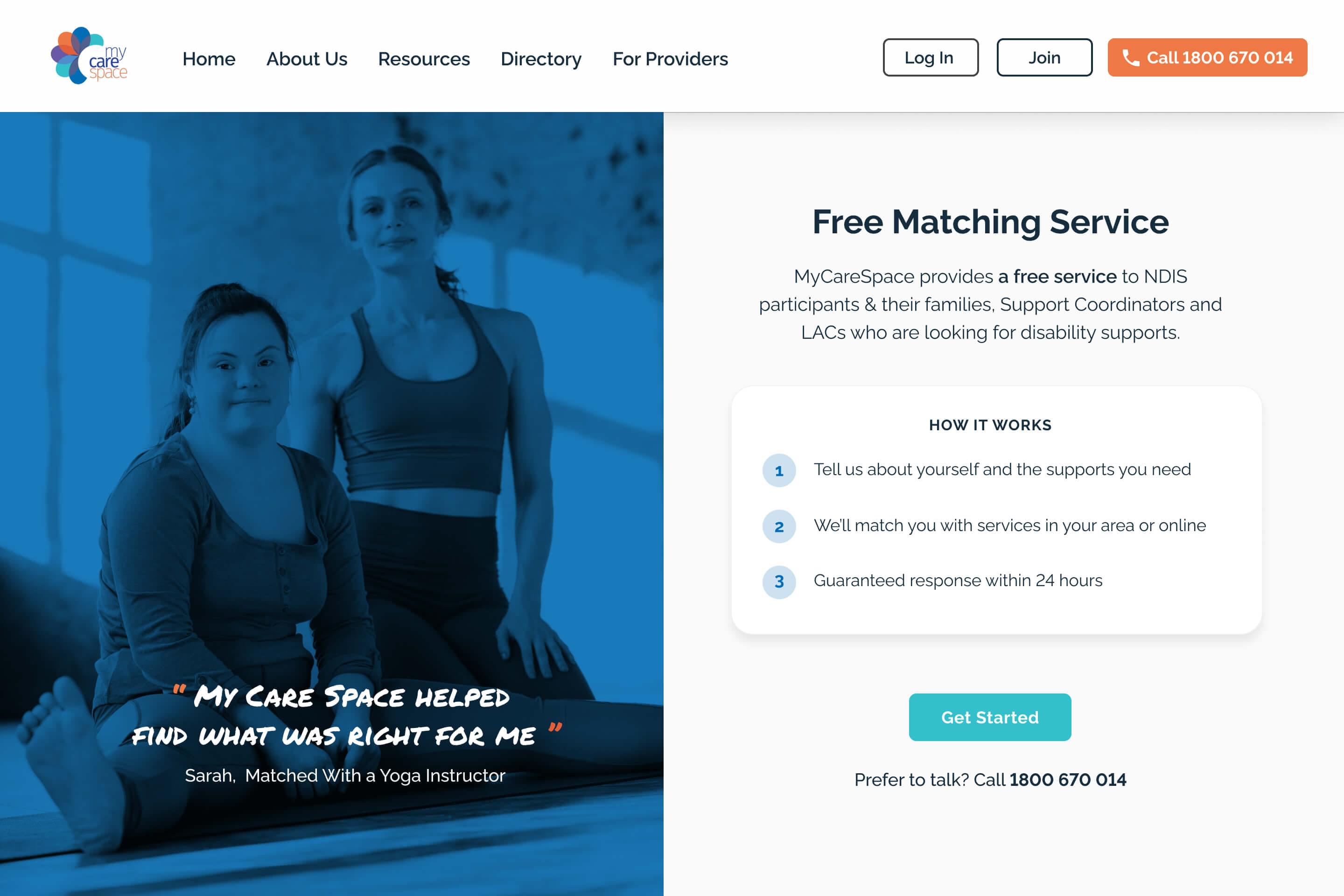
The new form keeps all information on a single page, with no scrolling required
-
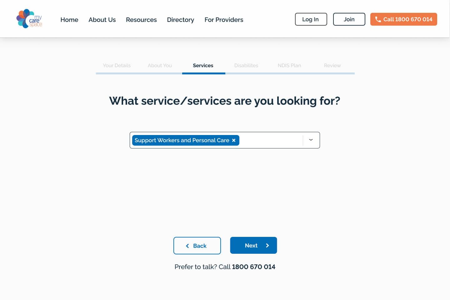
Segmenting the Form
Our users were put off by the long form on the VIP page – so we broke up the form into smaller chunks and reduced the overall cognitive load.
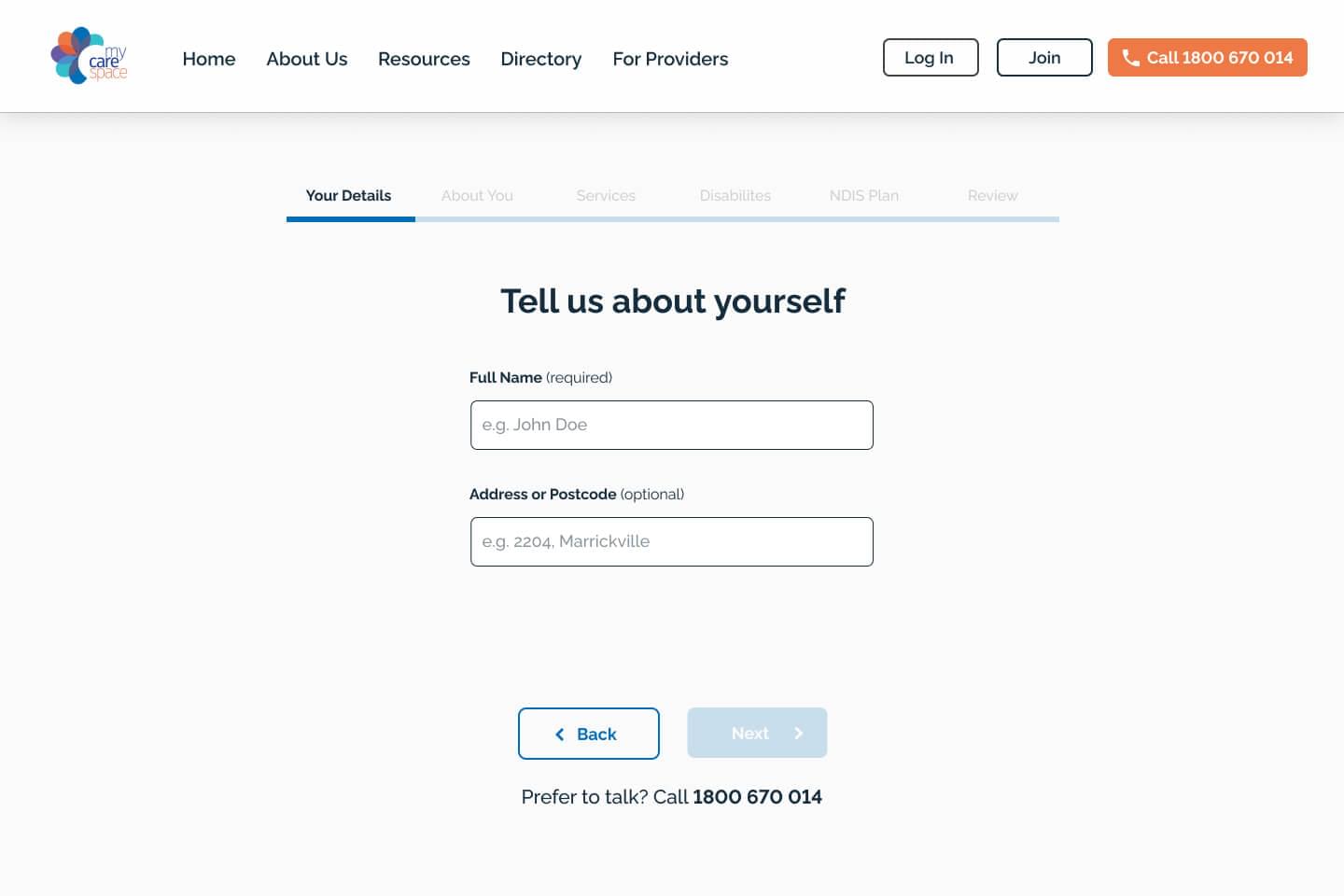
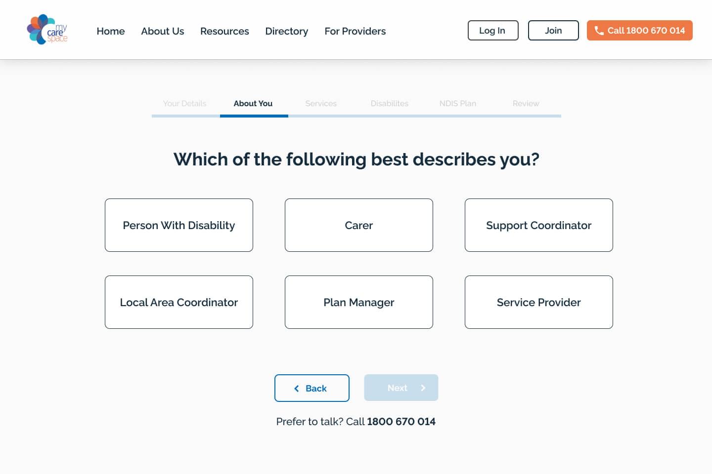
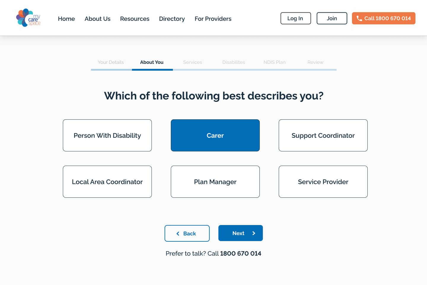
We added navigation at the top of form to show users their progress through the form
-
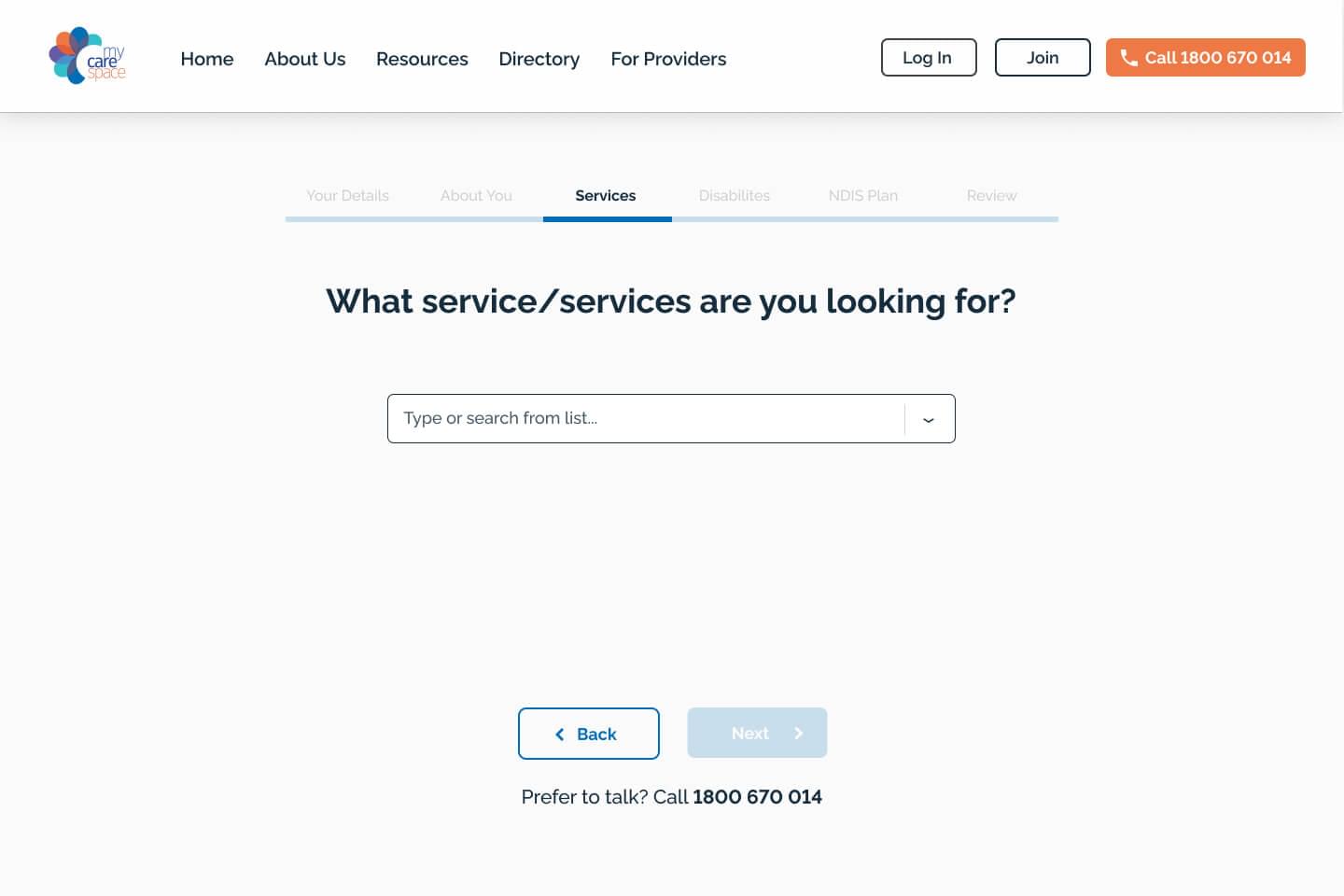
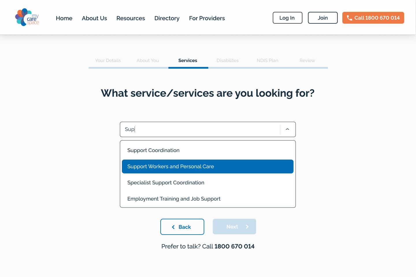
Multiple Choice
Instead of asking users to type out or select choices from a lenghty drop-downlist, we added live searchable fields that respond as you type.
-
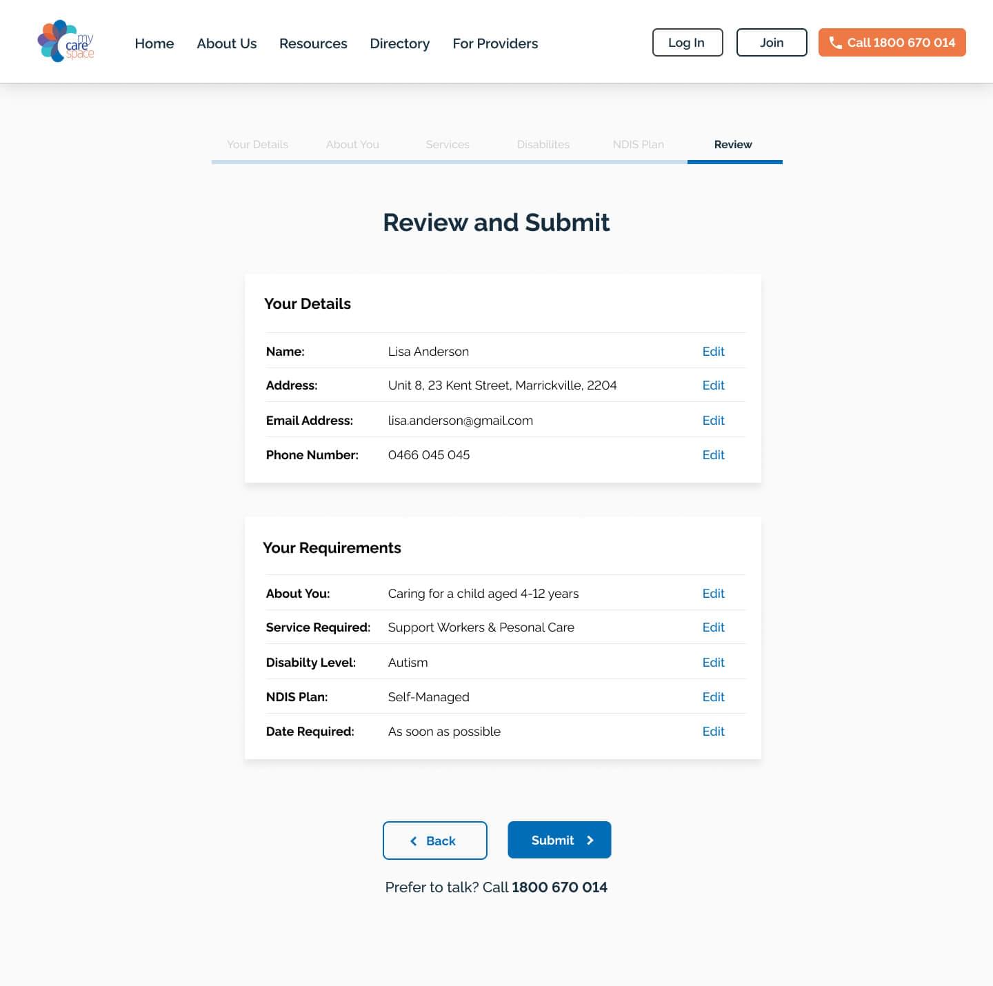
Reviewing The Data
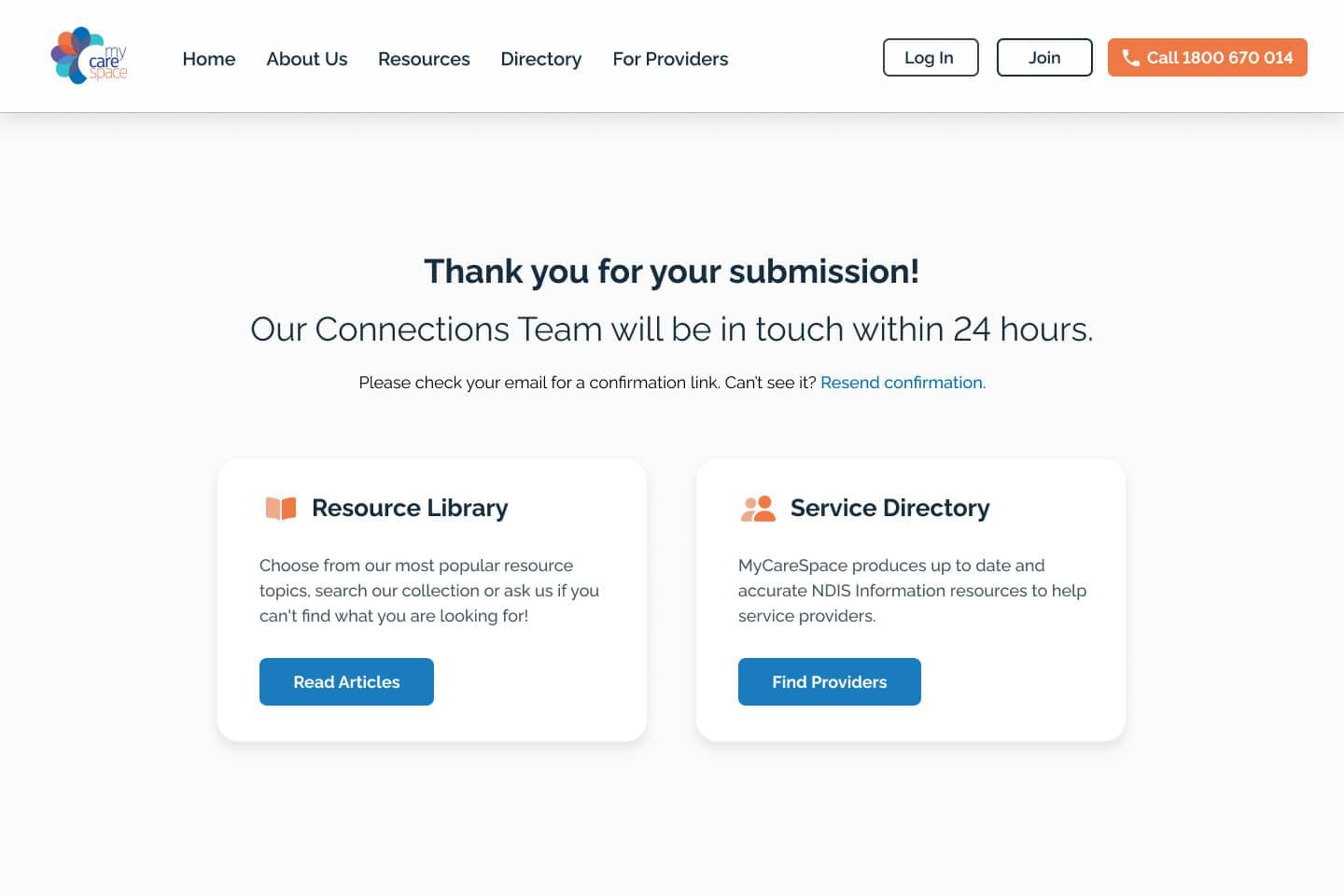
The review screen before submission provides the user with a reminder of their selections, and allows them to edit each section of the form.
The new homepage kept the typeface and colour scheme from the existing brand.
-
Final State
The the final confirm screen reassures the user that MCS will get back to them in 24 hours – and provides additional steps for them to continue their journey.